Streamlining the Travel Insurance experience
ROLE
Senior UX Designer
TIMELINE
4 Months

PROJECT OVERVIEW
Travel insurance is often a grudge purchase that is complex, confusing, and bought in a hurry. Over four months, I utilised targeted research to transform a cluttered, legal-heavy process into a streamlined experience.
↑ The result was a 15% increase in conversions, alongside significant improvements in user satisfaction, task success rates, and accessibility, while simultaneously reducing the strain on internal resources.
MY ROLE
I led the design of the travel insurance purchasing experience over a 4-month period. My primary focus was redesigning the quoting and purchasing journey to drive conversion and clarity.
I worked in a cross-functional squad, collaborating closely with service designers to map the end-to-end service blueprint and identify backstage friction points. I partnered with developers to stress-test the technical feasibility of dynamic features and worked alongside underwriters and content designers to translate dense legal requirements into plain English content.
I was responsible for the end-to-end design process, from discovery and definition through to high-fidelity prototyping, usability testing and hand-off.
THE CHALLENGE
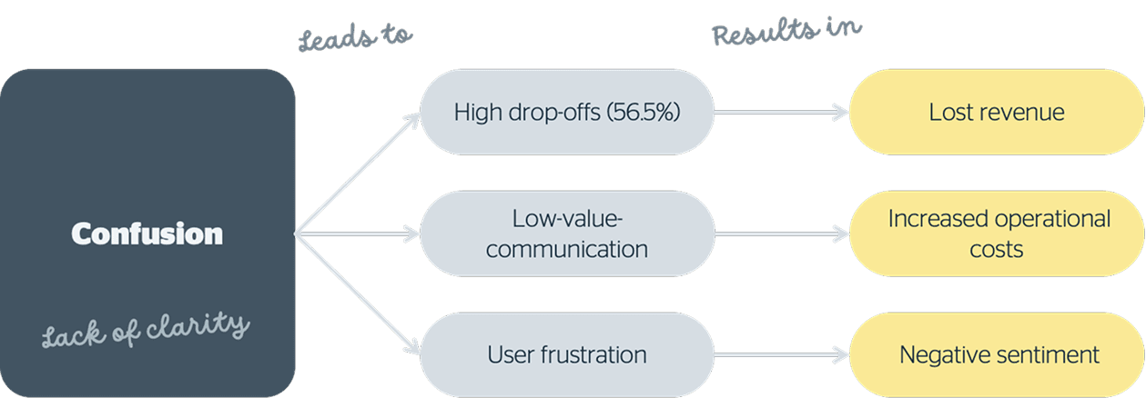
The Burden of Information
Travel insurance is inherently complex. However, by the start of this project, the existing experience had become an overwhelming wall of text. Front-line staff were bogged down by low-value communications, and users were left feeling confused and anxious.
I found that the digital experience did not meet WCAG 2.1 accessibility guidelines, drifted from the design system, and lacked a clear value proposition. As one user put it during my initial review:
“I just feel like that's really quite cluttered... It's kind of like you're having to read a novel.”
My goal was not just to "fix the forms," but to fundamentally shift how members perceive value and protection. I needed to address critical pain points to:
Increase uptake by new and existing members.
Improve the member experience by reducing friction.
Create a unique value proposition in a crowded market.
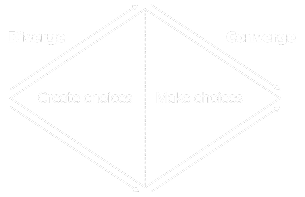
FALLING IN LOVE WITH THE PROBLEM
I adopted a methodology of "falling in love with the problem, not the solution." I needed to go wide (divergent thinking) before I could narrow down on the right features.
To understand the ecosystem, I partnered closely with Service Designers to look beyond the digital interface and map the entire service blueprint. I analysed 166 user complaints, reviewed 112 thread comments, and surveyed 3,833 users on their perceptions. I didn't just look at data; I looked at the human element, interviewing sales and claims staff and listening to 132 service calls.
Visualising the Ecosystem
I mapped out the experience to better understand the pain points in the journey for both the frontstage and backstage.
Early Insights from the Field
I interviewed front-line staff and users to deeply map the purchase quote journey. What I found challenged my assumptions about how people buy insurance.
I assumed users sat at desks to compare policies carefully. The reality was chaotic. Users were purchasing in a wide variety of high-stress situations: on the way to the airport, while packing, in waiting rooms, or at midnight with children crying in the background.
This high-stress context made the existing 'wall of text' experience unbearable. Users reported that the information overload made the process feel "too hard." They desperately needed efficiency, flexibility, and immediate answers to key questions without wading through legal jargon.
I visualised how each friction point—like complex jargon or rigid forms—compounded the user's stress, directly correlating with drop-off rates.
Defining the Direction
Through my research, I identified four key demographics who were experiencing the most intense friction. It wasn't a one-size-fits-all problem; different life stages brought different anxieties.

New travellers
Often had an unrealistic understanding of insurance capabilities and felt high financial stress.

New parents
Time-poor and driven by a shift in needs to protect their children.

New retirees
Faced with the "harsh realisation" of insurance costs, expecting loyalty rewards.

Experienced travellers
Valued spontaneity and flexible dates but struggled to find products that matched their specific desires.
Establishing Core Principles
I analysed this rich quantitative and qualitative data to create affinity maps. From this, I distilled six core design principles to guide the ideation phase, including Simplicity and Efficiency, Honest Transparency, and Supporting Spontaneity.
1
Simplicity and Efficiency
Ensure that processes are seamless and straightforward to use.
2
Clear answers
Provide direct, plain English answers to common questions.
3
Allow for spontaneity
Support customers in making last minute travel decisions without penalty.
4
Flexible and tailored options
Allow customers to customize policies to fit their specific needs.
5
Honest and transparent
Everything should be clear and easy to understand, with no hidden policy surprises or costs.
6
Information and insights at the right time
Share meaningful guidance and knowledge when it is most useful, such as before cooling off period end.
THE REDESIGN
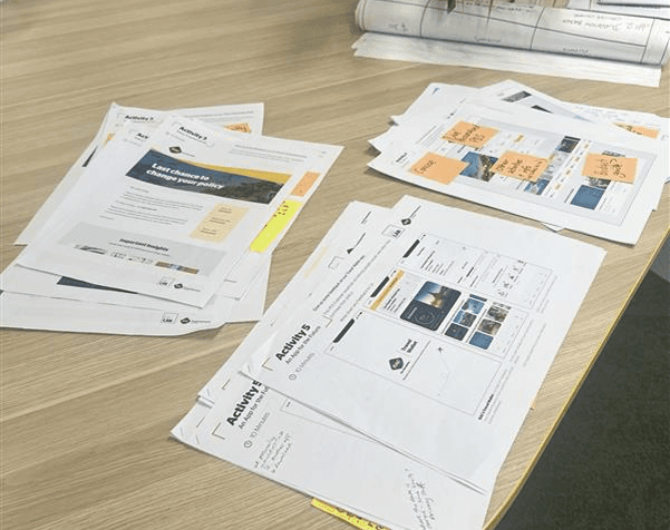
I facilitated a co-design workshop series with 34 regional and urban users. By leveraging the data from the definition phase, I prioritised enhancements across four journeys: Purchasing, Post-Purchase, Emergencies, and Claims.

Leveraging rich data to inform and prioritise design decisions
What should we design? What should we prioritise? By leveraging rich data from user research and co-designed solutions, we designed enhancements and new features.
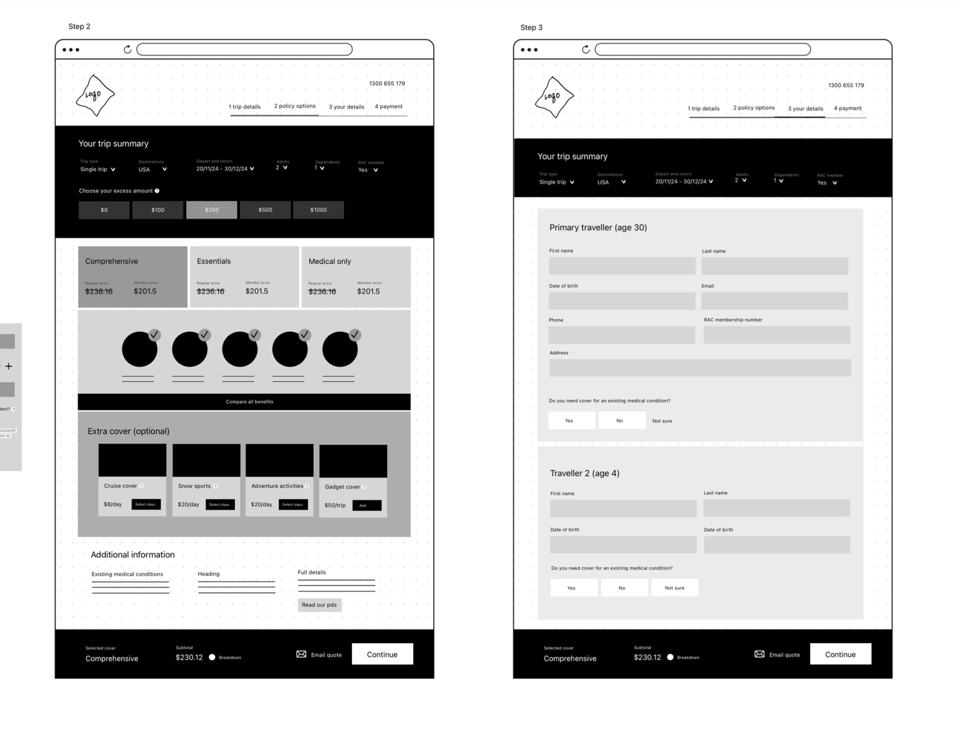
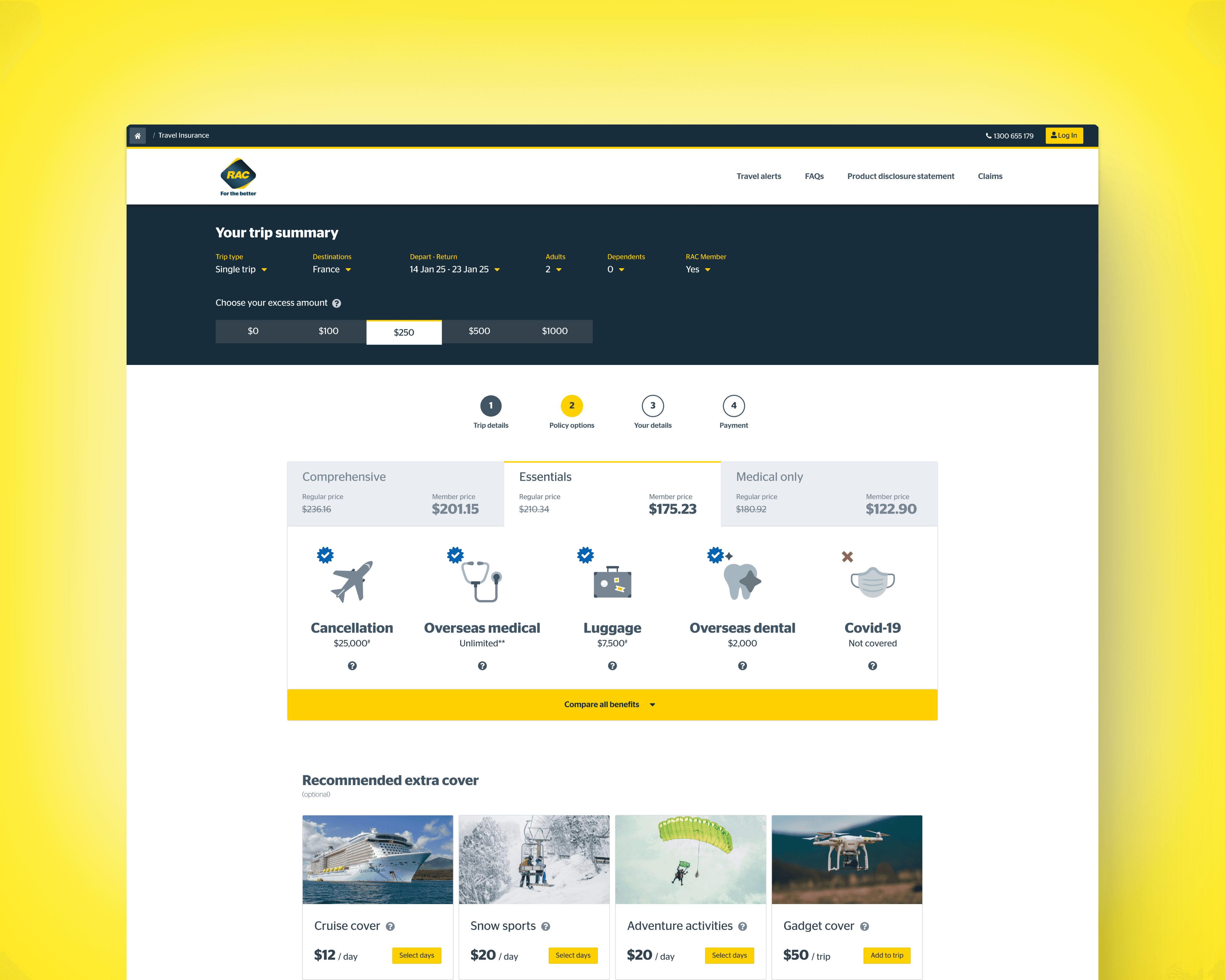
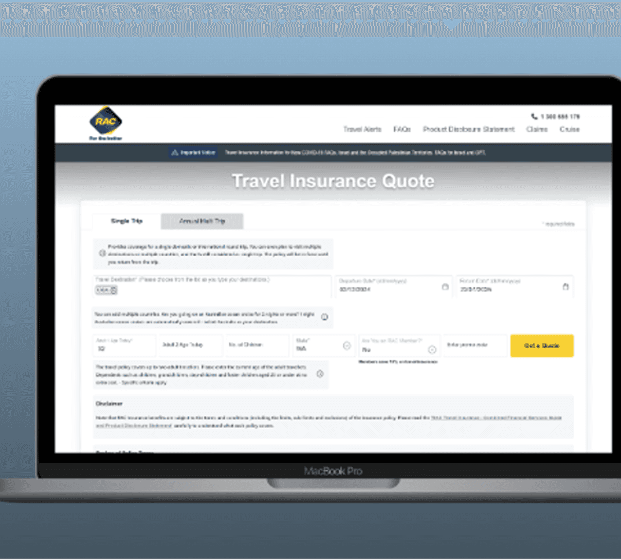
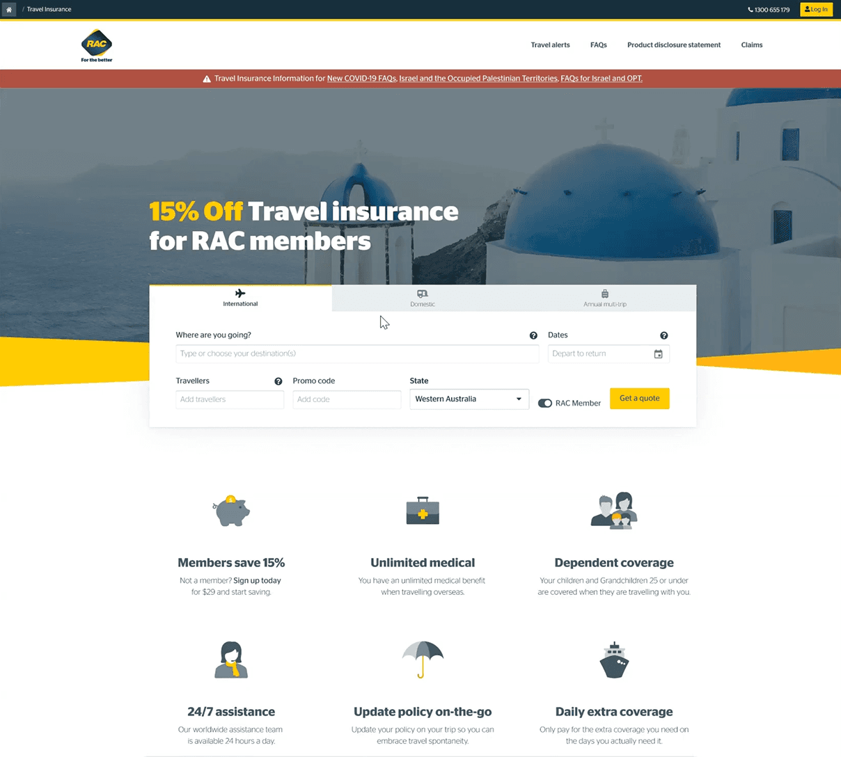
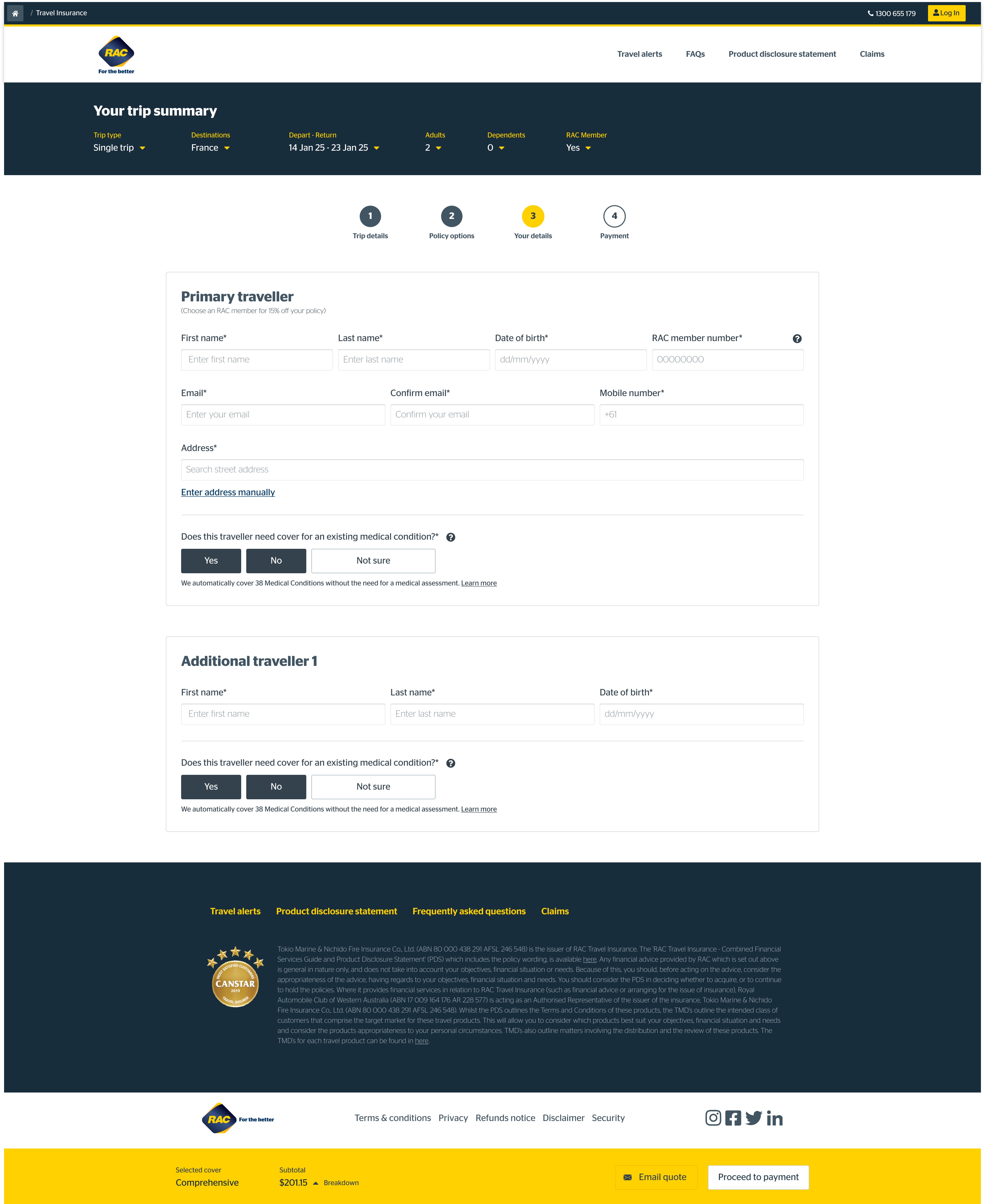
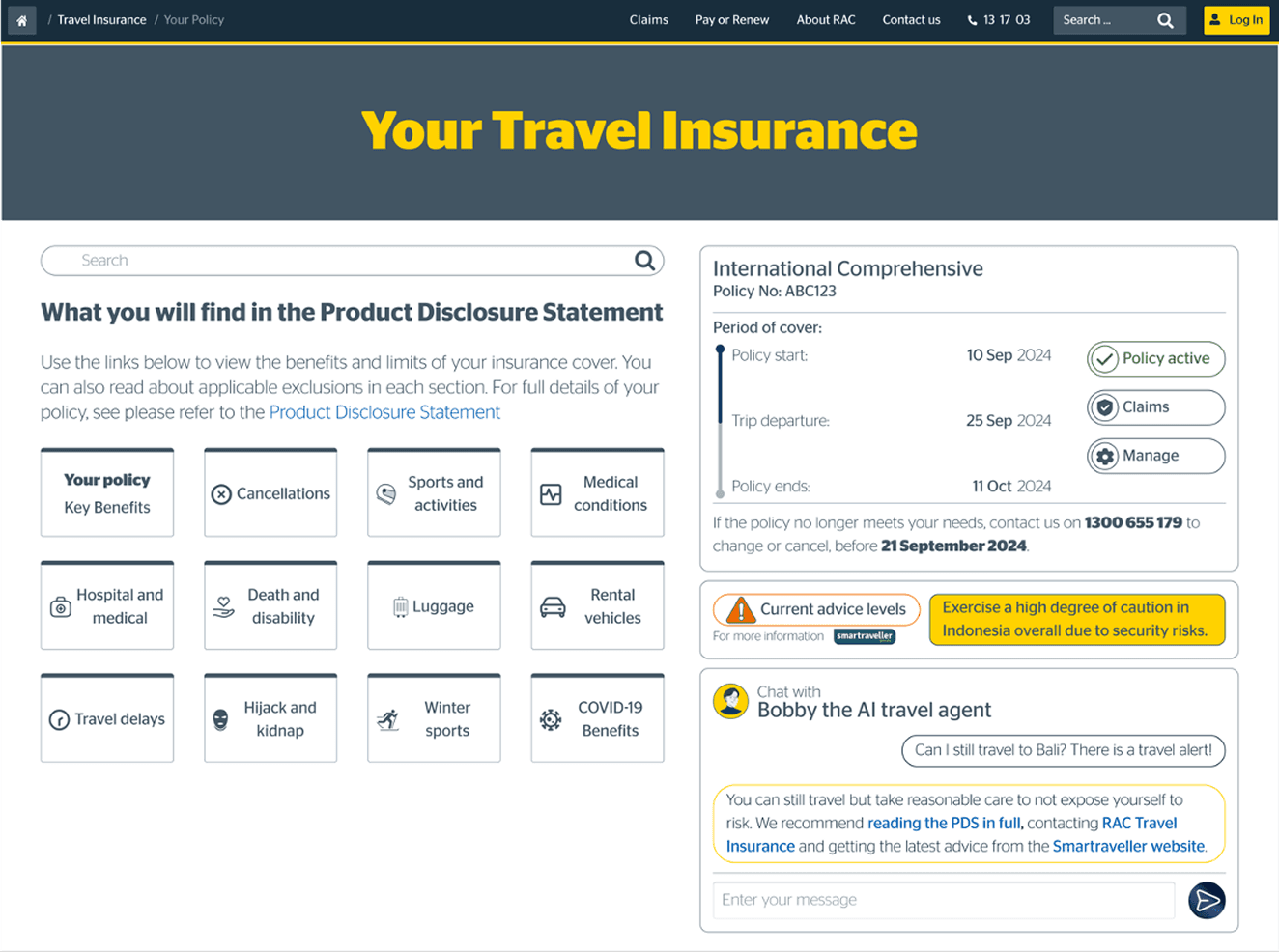
The Quoting Journey: From Rigid to Responsive
A simpler, more streamlined quote form that offers greater clarity and an improved user experience. Users can now easily see the value for members (15% off) along with other standout features, making it more prominent compared to the previous state.
Previous
Enhanced
From pain points to opportunities

“How much does it add per country? Ah I'm going to Asia, Europe, Vietnam, Laos, Thailand, Cambodia… Are you able to put down all of Europe? No? Um, Germany, France, Italy, Spain, Portugal, Greece…Am I able to add countries on the go?“
Sales call - "new traveller" demographic

How might we make cover easy for people travelling to multiple, or unplanned destinations?
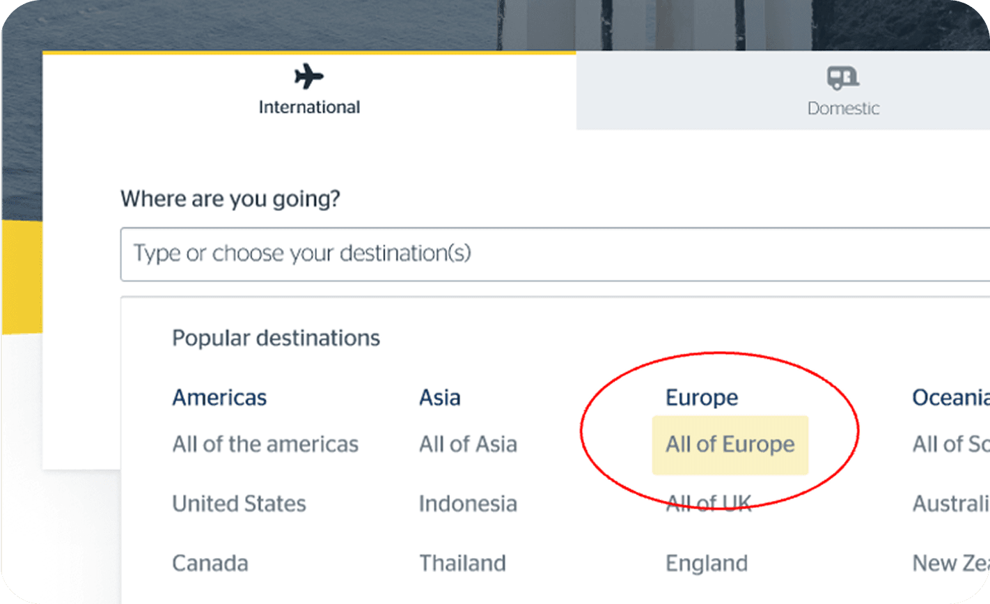
Duration based add-ons
A cleaner, more intuitive policy selection process paired with duration-based add-ons personalised to the user's destination and demographic.
“A tailored policy offering for different demographics. One size does not fit all!”
“We love that this is tailored to us”.
“This makes the cost much more reasonable”.
Workshop participants
Traveller details
Simpler, more straightforward forms that minimise confusion and provides clarity about existing medical conditions.
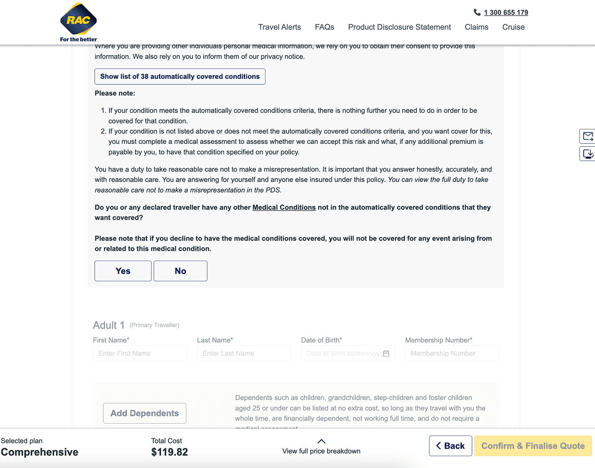
Previous
Enhanced
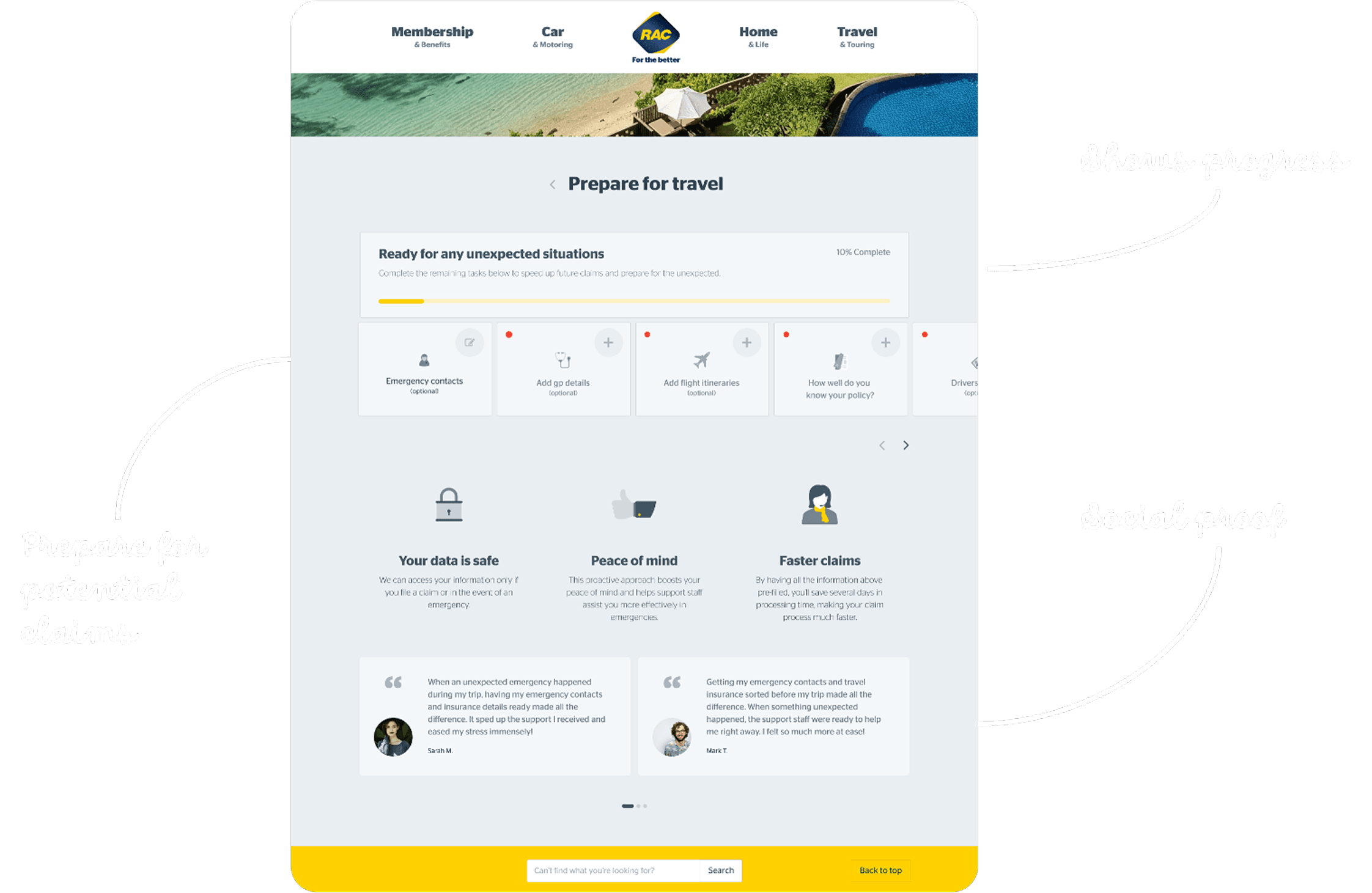
Post-Purchase: Preparing for the Worst
Interviews with claims staff revealed a startling statistic: in 90% of claims, the customer does not know what documentation they need. This led to stalled claims and frustrated users.
I introduced a "Preparing for Travel" flow in the post-purchase journey. This educates users on document management before a stressful situation occurs, promoting a faster claim process later.
“Provides opportunity for travellers to revisit the details of the policy and take out the right kind of cover. This could reduce the likelihood of contentious claims”.
“Easy and informative way of finding answers”.
Test participants
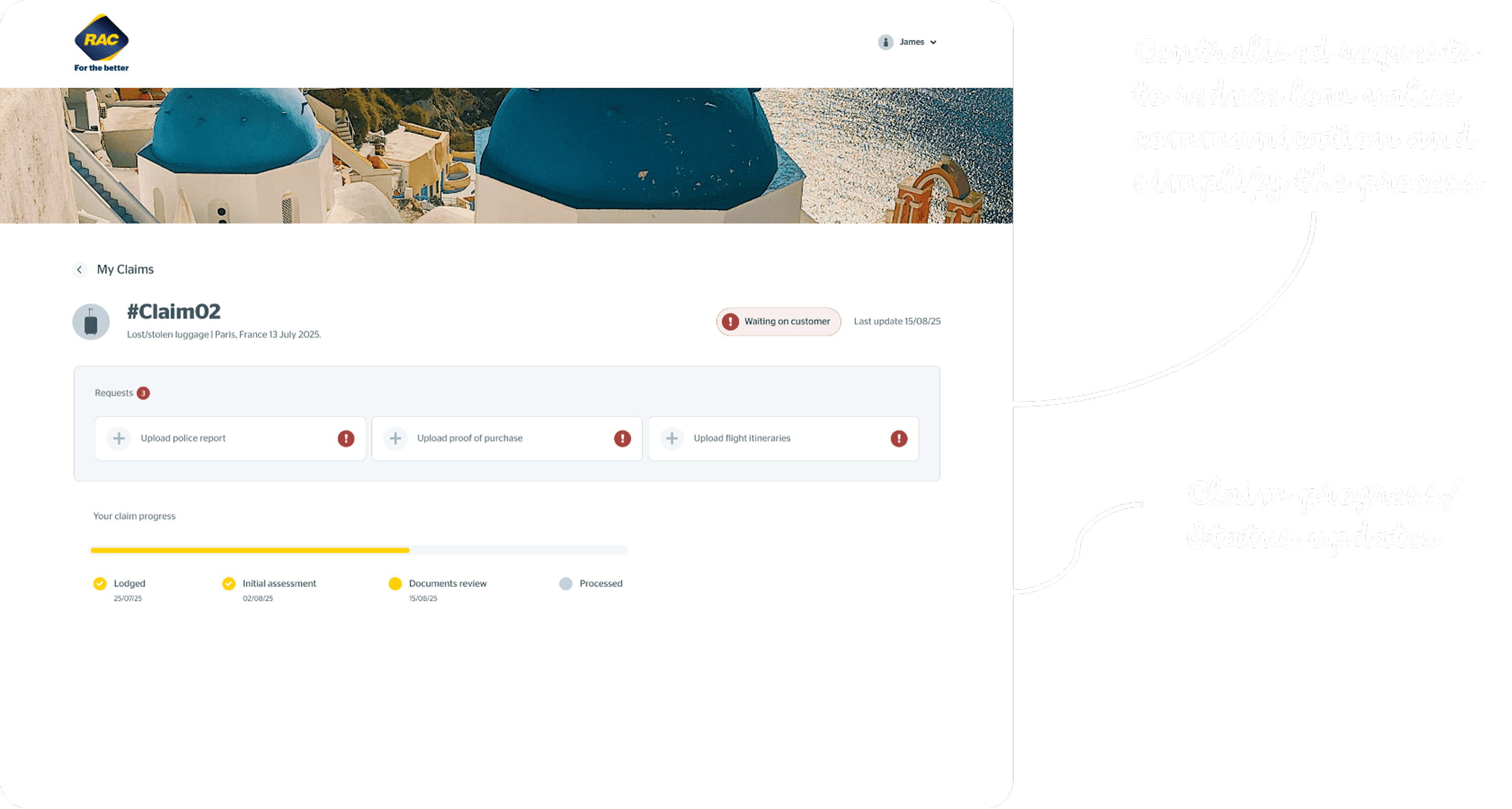
Enhanced claim experience
A smoother, more efficient claims experience, improving customer satisfaction and reducing staff workload, ultimately enhancing overall operational efficiency.
“In around 90% of claims, the customer does not know what documentation they need to give us, and this may vary from claim type to claim type.”
Claims and Sales Staff Interviews
LEARNING FROM FAILURE
I embraced the concept of "Flearning," or learning from failure.
My initial prototype for a PDS (Product Disclosure Statement) Explorer didn't hit the mark. I attempted to make the legal documents interactive, but testing revealed it was overwhelming and actually made the policy information more difficult to digest.
I worked closely with underwriters and content designers to understand the strict legal requirements of the PDS. Together, we pivoted from an interactive explorer to "Plain English" summaries. This collaboration ensured we provided direct answers to specific questions without compromising legal compliance.
IMPACT
Validating the New Experience
To validate the designs, I conducted 20 unmoderated usability A/B tests and surveyed over 2000 Australians within the target audience.
The shift from a complex, text-heavy experience to a streamlined tool resonated immediately with users.
“It’s so much easier to understand and it's just a lot easier to navigate visually.” — Test participant
“I feel like this process of getting a quote was a lot more straightforward. It wasn't as overwhelming.” — Test participant
Outcomes
National Scalability: The success of this redesign prompted the underwriter to facilitate collaboration amongst other RACs across Australia. These design solutions are now being adapted as a standard for travel insurance experiences nationwide.
Business Growth: We observed a 15% increase in revenue compared to the same period the previous year, validating that reducing friction directly drives conversion.
Clarity: Users reported a significant increase in ease of use and understanding.
Efficiency: The new "Preparing for Travel" flow is projected to reduce low-value calls to claims staff and speed up claims.
Sentiment: Member feedback shifted from "cluttered and hard" to "tailored and reasonable."
By focusing on the user's context, whether they are a stressed parent at the airport or a retiree planning a dream trip, I moved the product from selling a complex legal contract to providing a streamlined, reassuring travel companion.
This will hide itself!