Turning a 40 min. Biometric Health Assessment into a 15 min. seamless experience
ROLE
Senior Product Designer
TIMELINE
10 weeks

PROJECT OVERVIEW
Biometric Health Assessment (BHA) is a smartphone-based health screening app that uses camera and sensors (face scan, finger scan, etc.) to estimate health markers.
PROBLEM
Despite ~$100M invested over 8 years, the BHA app had never been user-tested. It was clunky and confusing – taking ~40 minutes to complete an assessment with many users dropping off in frustration.
APPROACH
Led a user-centered redesign from the ground up: conducted usability research to identify pain points, facilitated ideation workshops, revamped user flows, and redesigned the UI with a focus on usability, feedback, and accessibility.
OUTCOME
Cut average completion time by >50%. Boosted task completion rates (e.g. FaceScan success from 40% to 100%) and improved user satisfaction (from ~3/5 to ~5/5 on key modules). The new design earned positive feedback from users, stakeholders, and opened the door for new investments from different government bodies globally.
1
Discovery
2
Ideation
3
Design
4
Impact

DISCOVERY & INSIGHTS
To tackle the problem, I kicked off the project with thorough research and alignment
Stakeholder & team kickoff: I organised a kickoff meeting with product managers, developers, and healthcare SMEs to clarify goals and gather any existing knowledge. We also compiled assumptions and questions about the current BHA experience.
Heuristic evaluation: First, I walked through the existing BHA app myself and with team members, noting usability issues (e.g. unclear navigation, lack of feedback, accessibility problems)
User sessions: We then recruited a few target users to observe them trying the BHA. We timed each step, noted where they hesitated or got frustrated, and collected qualitative feedback after.
My challenge was clear: streamline and humanise the BHA experience so that people could actually complete it and trust the results.


Key Findings – Pain Points Identified from user testing
Excessive Completion Time: On average it took ~40 minutes to finish. Users found this far too long, and many gave up before completion.
User Frustration with Long Scans: Certain health checks (especially the face scan and body scan) required users to hold still or perform actions for several minutes. Users grew impatient and anxious during these prolonged scans.
Unclear Purpose of Steps: Users weren’t sure why they had to do certain tasks (e.g. what does a finger scan do?). This lack of context led to confusion and reduced their motivation to continue.
Poor Feedback Loop: During some tests (notably the finger scan), the app gave no progress indicator or feedback. Users often glanced around or tapped the phone wondering if it was working, breaking their concentration.
Usability Issues: The UI controls were not user-friendly – for example, small buttons and text made it hard to use, especially under the stress of performing health tests. This caused input errors and added frustration.
Accessibility Gaps: The design did not account for users with impairments (visual, motor, etc.). Color contrast was low in places and instructions were walls of text, making the process even harder for some users.
IDEATION AND STRATEGY
Ideation workshop facilitation
I facilitated an ideation workshop to brainstorm how we might solve the identified pain points. We transformed each pain point into a "How Might We" question – for example, “How might we provide feedback during scans to reduce user anxiety?” This approach sparked creative solutions focused on user needs.
We generated a range of ideas, then prioritised them by impact and feasibility. We categorised ideas into three buckets: “Must-do Improvements,” “Nice-to-have (consider),” and “Needs further validation.”
I also worked closely with the development lead to understand technical constraints (e.g., minimum scan durations required by the algorithms) so our solutions would be realistic.

Next, I revisited the user flow of the entire assessment:
I mapped out a revised flow that minimised steps and made the sequence more logical. For instance, we combined certain screens and eliminated redundant prompts to shave off time.
We wrote simple user stories to ensure every design decision kept the user's perspective in focus.
"As a user, I want to move seamlessly from one step of the health assessment process to another, so that I can complete my comprehensive health evaluation efficiently and receive my health report without any confusion or delay."
"As a user, I want to move seamlessly from one step of the health assessment process to another, so that I can complete my comprehensive health evaluation efficiently and receive my health report without any confusion or delay."

Sketching
Sketching helped me bring the apps user flows to life. During this process, I grasped an overall idea of how I wanted it to look and feel.
Sketching
Sketching helped me bring the apps user flows to life. During this process, I grasped an overall idea of how I wanted it to look and feel.

DESIGN
Wireframing
In the initial medium-fidelity wireframes, I assigned wireframes based on the user flow each team member previously worked on. Given the BHA's responsive design, we started with mobile screens before moving to desktop versions. User flows two and three shared some screens, so I coordinated with the designer for user flow three to ensure design patterns were user-centric. We iterated on each user flow and presented our designs in team sessions for consistency. Anticipating UI iteration work, I encouraged exploration in design patterns using a flexible wireframing kit for style adjustments in later weeks.

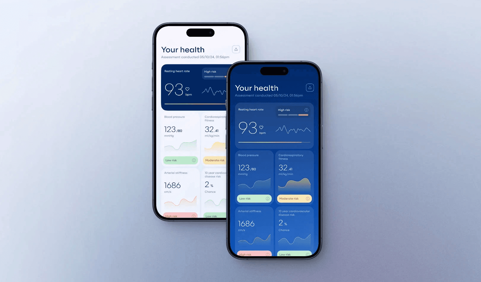
High fidelity screens
Incorporating feedback from stakeholders and developers on the wireframes and UI iterations, I worked on the high-fidelity prototypes for testing and handoff. I collaborated with other designers to address challenges they encountered in organising or constructing elements. We ensured that all UI elements, text, and the colour palette were compliant with WCAG 2.1 AA standards.


IMPACT

Biometric Health Assessment average completion time: 39:23min
Health Profile:
Average completion time: 2:39min
Satisfaction score: 3.2/5
Task success rate: 40% Struggled / 60% Completed
FaceScan:
Average completion time: 6:21min
Satisfaction score: 3/5
Task success rate: 60% Struggled / 40% Completed
FingerScan:
Average completion time: 3:08min
Satisfaction score: 3.2/5
Task success rate: 40% Struggled / 60% Completed
BodyScan:
Average completion time: 4:22min
Satisfaction score: 2.7/5
Task success rate: 20% Failed / 60% Struggled / 20% Completed
Step Test:
Average completion time: 5:31min
Satisfaction score: 3.6/5
Task success rate: 40% Struggled / 60% Completed

Biometric Health Assessment average completion time: 14:41 min
Health Profile:
Average completion time: 1:02 min
Satisfaction score: 5/5
Task success rate: 100% Completed
FaceScan:
Average completion time: 1:12 min
Satisfaction score: 5/5
Task success rate: 100% Completed
FingerScan:
Average completion time: 2:54 min
Satisfaction score: 4.1/5
Task success rate: 20% Struggled / 80% Completed
BodyScan:
Average completion time: 2:03 min
Satisfaction score: 4/5
Task success rate: 20% Struggled / 80% Completed
Step Test:
Average completion time: 5:31min
Satisfaction score: 3.6/5
Task success rate: 40% Struggled / 60% Completed
BUSINESS OUTCOMES
Reducing the completion time from 40 minutes to 15 minutes made the product a viable option for time-constrained environments like hospitals and clinics, particularly in markets such as Vietnam, South Africa and Canada. This shift unlocked opportunities that weren’t previously possible, enabling new partnerships and implementations. The improved efficiency and usability also helped open the door for multiple rounds of investment, as the product became demonstrably more scalable and attractive to health service providers.
Reducing the completion time from 40 minutes to 15 minutes made the product a viable option for time-constrained environments like hospitals and clinics, particularly in markets such as Vietnam, South Africa and Canada. This shift unlocked opportunities that weren’t previously possible, enabling new partnerships and implementations. The improved efficiency and usability also helped open the door for multiple rounds of investment, as the product became demonstrably more scalable and attractive to health service providers.
REFLECTION
This project was both challenging and rewarding for me. As someone passionate about the intersection of healthcare and technology, I was excited to work on a product leveraging AI for health – but I quickly learned that even the smartest tech needs a human-centered touch to truly succeed.
Key learnings and takeaways:
Design beyond the screen: Many parts of BHA happen in the physical world (e.g. standing still for scans, performing step exercises). Designing for these scenarios taught me to consider the entire user context. We had to get creative to keep users engaged and comfortable even when the app wasn’t doing much on-screen (like during the 30-second finger scan). Little UX details, like a progress bar or a calming prompt saying “Keep your finger still, almost there…”, made a huge difference.
Validation is crucial: Because this product deals with health metrics, we had an extra layer of responsibility. I learned to collaborate closely with the data science “labs” team to ensure any UX changes still yielded medically valid results. This sometimes meant iterating with constraints (for example, we couldn’t shorten a scan beyond what’s scientifically valid, so instead we improved the perception of wait time).
Leading a remote team: I headed a design team spread across time zones. I found that clear communication and documentation were our friends – from the kickoff call where we aligned on goals, to daily async check-ins on Slack. By keeping everyone motivated and informed, we avoided duplicate work and maintained a unified vision. I made a point to encourage open dialogue; some of our best ideas came from team brainstorming where every voice was heard.
Impact of UX: Seeing the quantitative improvements (time cut in half, success rates doubled, etc.) reinforced why I love this work. It was gratifying to watch users complete the assessment with a smile instead of a frown. The positive feedback from end-users and stakeholders proved that a focus on UX can turn a struggling product into a success.
In the end, our 8-week sprint transformed the BHA experience. What was once a tedious 40-minute ordeal is now an efficient, user-friendly health assessment. As a designer, I’m proud that our work is enabling more people to engage with their health through this app – technology is only as powerful as the user experience that delivers it, and this project was a great example of that principle in action.
This will hide itself!